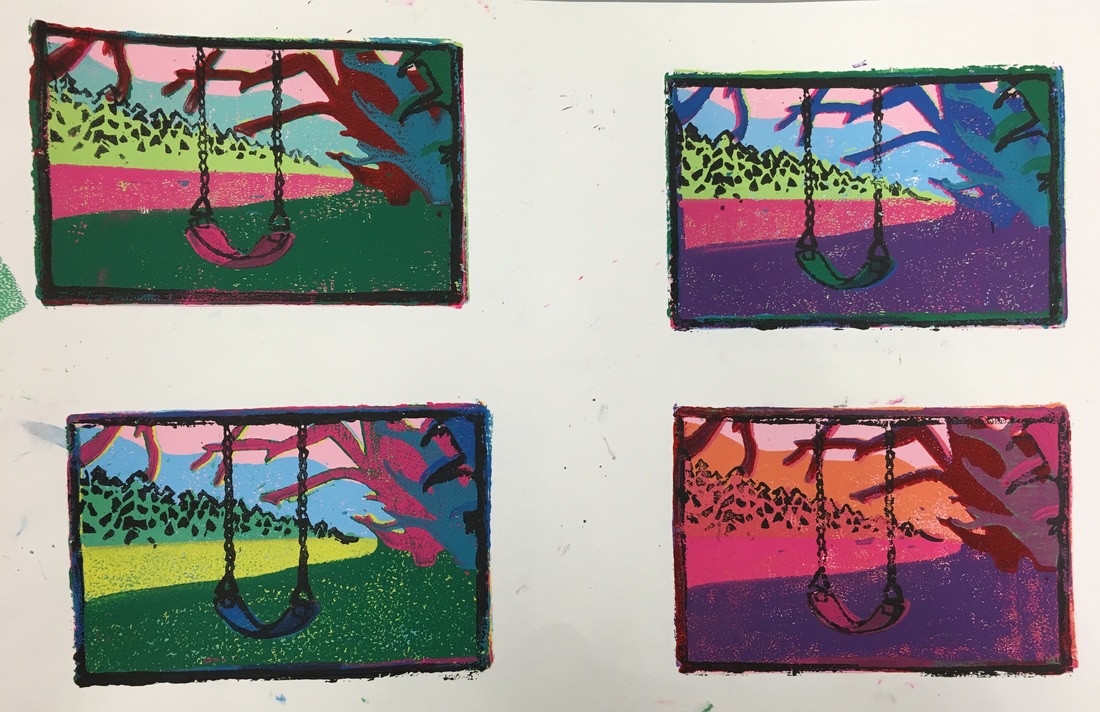
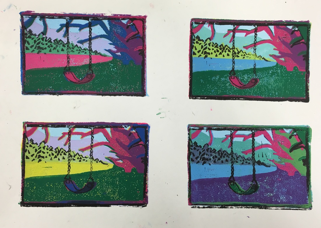
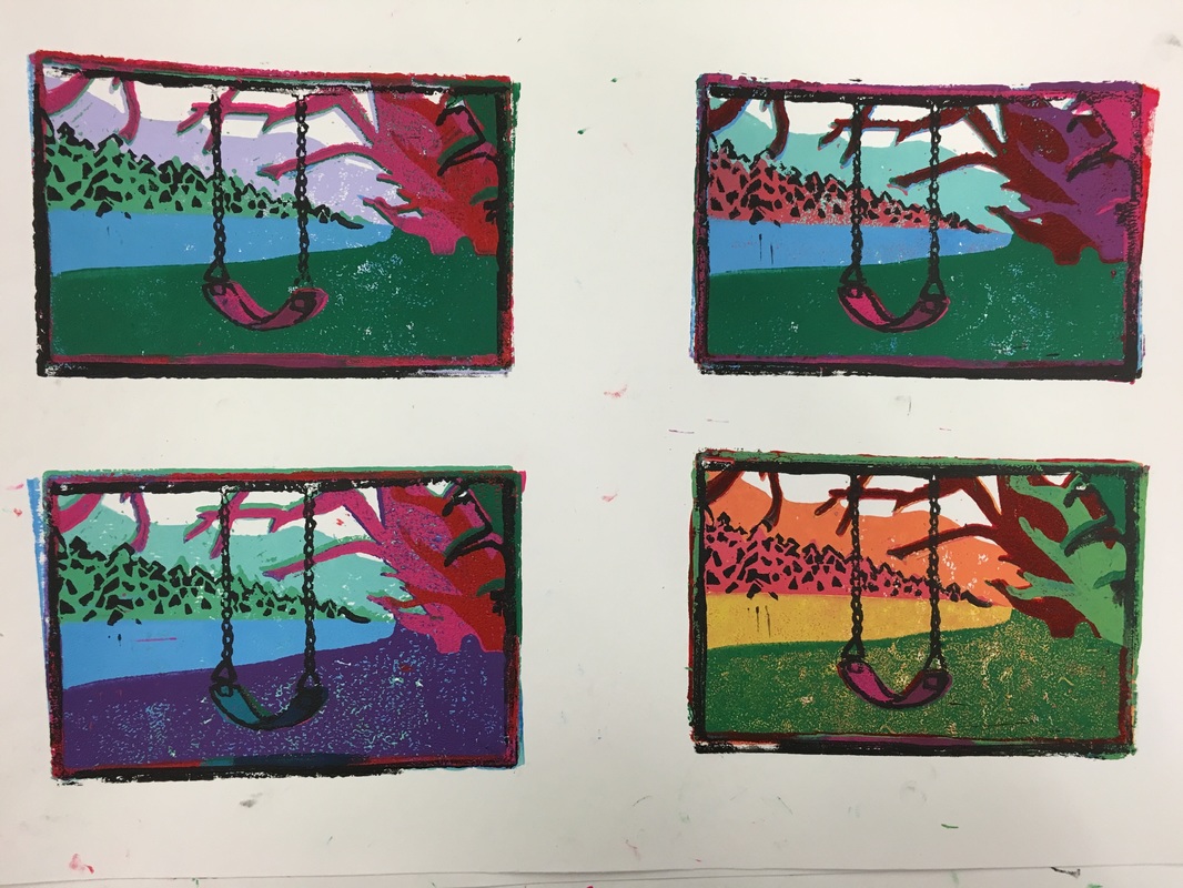
For this block print project I chose to do something more realistic than my last print, and based this print off of an image that I took. This was a reduction print, so I had multiple layers that I carved, and I actually used two different blocks to get the finished look. The main art element that I used in this project would be color, because the varying colors in each layer really make them stand apart. The use of colors also helps with perspective, and creates a background in the distance. A skill that I really worked on when doing this would definitely be my carving skills. There were so many small details, especially in the trees and swing, that I had to be very precise and make sure to make so mistakes. I think that in the end these turned out really well, and they are all unique. None of them are exactly the same, and they are very bold because they don't follow the usual colors you would see in a landscape.
|
|
Archives
June 2016
Categories |
 RSS Feed
