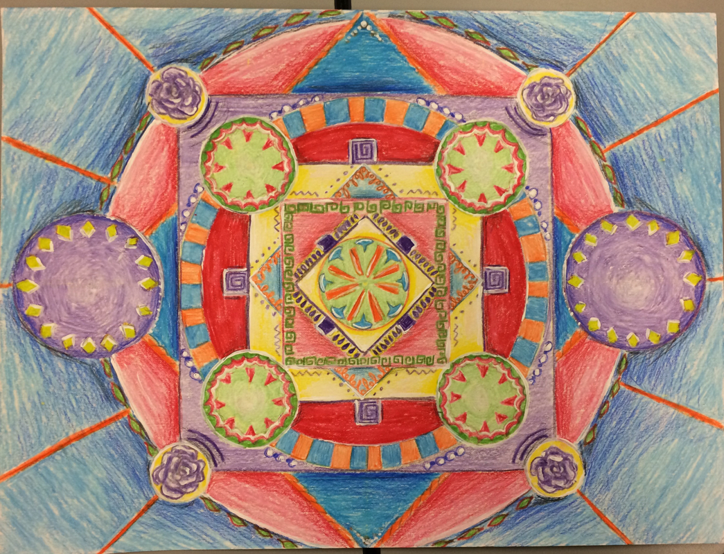
For the mandala painting I used squares and circles to create the geometric design. These mandalas are created often in Hinduism and Buddhism with these same shapes, and make it represent the universe. My version of this is mixed media, because I used colored pencil for the majority and then added white highlights with acrylic paint. In this project I used line, shape, form, and large amounts of color and value. It also has the design elements of contrast between each group of colors, and balance because everything is coming away from the original circle and the shapes are equally placed. I learned in this project how to add highlights to make it more complex and also improved on making smooth lines with colored pencils. In the end this project is very energetic and represents peace and is also a symbol of my view on things.
For this project I used a picture I had, and turned it into disney style painting similar to Eyvind Earl. I used tempera paint, and worked on using different shades of blue to show space, and how to add details and bright colors at the closest part of the painting. By having the shapes in the painting and the bright colors i have used the art elements of line, shape, form, color, space, and some texture in the trees and water. I also the design elements of proportion/scale by showing distance with the colors, emphasis on the front trees, and contrast by using the bright colors against the dark to make it stand out. By doing each of these things and working carefully on the details this painting looks positive, bright, and very much like a disney fairytale.
For my choice project, I chose to do another landscape, but this time with colored pencils. I worked on varying the shapes and colors of things to make parts stand out, and on blending with the pencils. In this drawing I used the basic elements of line, shape, form, and I used a lot of color throughout the drawing as well. By having it look complete and correctly sized, I also use the design elements of unity and proportion/scale. This drawing is bright and colorful, and is overall very positive. This painting is done with tempera and is based on the same photograph as the dull landscape painting. However, this painting uses impressionist color, meaning it uses more primary and complementary colors to make it look bright. I continued working on putting complementary colors together, and using purples, blues, and other colors to make shadows instead of black. In this painting I used the basic art elements of line, shape, form, texture, color, and space. I also used the design elements of contrast between complementary colors, proportion/scale, and emphasis. This painting has a brighter more positive look than the dull painting, and has more of a natural light look than others. This piece was done using tempra paint, and is based off of a picture I took in Colorado. The point of this painting was to use only brown, peach, black, red and green, or to use local color. I worked on looking at photos in different edits to see how dark or light a certain part of the painting needs to be. In this painting I used the art elements of line, shape, form, texture, and color. The design elements were proportion/ scale, unity, and emphasis on the lager trees. This painting looks dark due to the colors used, and it almost gives off that kind of feeling as well. In this painting I used tempera paint to create an up close image of something natural and unnatural. I chose dandelions and colored pencils, and in doing this I worked on adding complementary colors, blending colors to get just the right one, and creating the right scale for an image. I used the art elements of line, shape, form, value, and color. I also used the design elements of proportion, balance, contrast, and especially scale. This drawing shows a new way of looking at the flowers, and creates a distinct contrast between the world of nature and the objects we use everyday. This painting is showing three different views of my face, and was done using tempra paint. As I worked on this painting I learned how to mix the right skin tone with green and orange, how to put in shadows with paint, and how to make hair look more 3D. In this painting I used art elements of line, shape, form, value, color, and texture. I also used design elements of proportion and scale, contrast between light and dark lines, and balance. This painting is realistic with the shading and proportion, and it shows concentration and an overall idea of balance with the three different heads. In this drawing I used multiple pencil types to draw three different views of my face. I learned how to use apps to find the basic shapes, and that it is important to find the proportions and features of the face before adding the details in. I tried to incorporate this as I drew these. In these three drawings I used the art elements of line, shape, form, value, and texture. I also used the design elements of proportion/scale, unity, and balance. I added contour lines and shading to help these drawings look more three-dimensional in the end. These are also very detailed, and come across as more serious than other artwork.
This painting is done with tempera paint, and is based on a picture I took outside of my school. I started painting with light colors and big shapes, and slowly added details. The art elements I used in this painting are line, value, shape, form, color, and texture (especially in the trees). Together, these art elements made up the principles of design that I used, including balance, contrast, emphasis, and proportion and scale. This painting is very bright and colorful, as the colors were enhanced more than in the photograph to make things stand out. Doing this and using the different techniques I did, the painting looks cheerful and creates a positive spin on things.
In this two-point perspective drawing I used a pencil and ruler to create the sketch. The goal of the drawing was to do it in groups so that each person's drawing showed a different part of the hallway. While making this I used the art elements of line, shape, value, and space, which are very important in showing how close and far things are to the viewer. I also used the design elements of proportion/scale, movement, and balance. Although it appears very simple, the details and the illusion of space help to make it interesting and realistic.
|
AuthorMSHS Art Class Archives
June 2015
Categories |