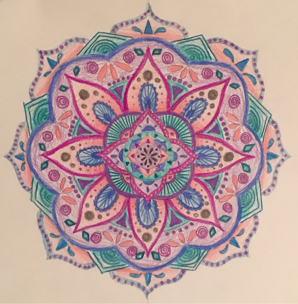
This was the final project that I did for the year. This mandala was done using colored pencils and uses lots of intricate details and colors.
|
This was the final project that I did for the year. This mandala was done using colored pencils and uses lots of intricate details and colors.
0 Comments
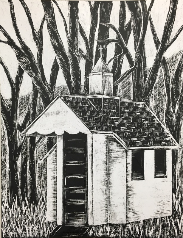 This project was based off on an image that I took when down at the Skagit River. This building was so small and white, and it really stood out among the forest trees. For this project I scratched out all of the white areas, or highlights, and left the darker areas alone. The art element that I really focused on in this piece was contrast. The contrast between the bright white areas and the black areas are what really help to create the shapes in the image. Without contrast between the light and dark there would be no distinct lines or objects. When only using black and white, the contrast is really important when it comes to making an image show up. The skill that I would say I worked on the most during this project would really just be working with the blade, and working on the scratching. I had never done this before, so the materials and technique were new. I also had to really work on getting the different values. The bright whites were easy to scratch out, but it took more concentration and time to make the other in-between values. In the end I'm proud of the way that this project turned out, and I like that it is something unique that I haven't done before.
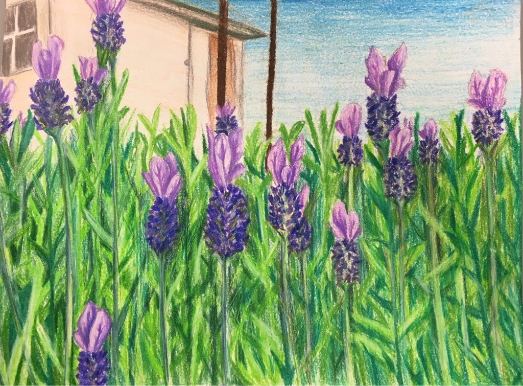 For this second project I continued the flower/nature theme and did another colored pencil drawing. For this piece the art element that seems the most important would be color. The colors in all of the leaves and flowers help them to stand apart from each other and they also help to add value and make it realistic. The skill that I worked on for this piece would be blending, especially on the leaves. I had to work on using the blending pencil to get all the values to look clean and crisp, and to avoid white spaces. This project is also one of my favorites, and I love how unique the lavender is, because it isn't a common flower to draw.
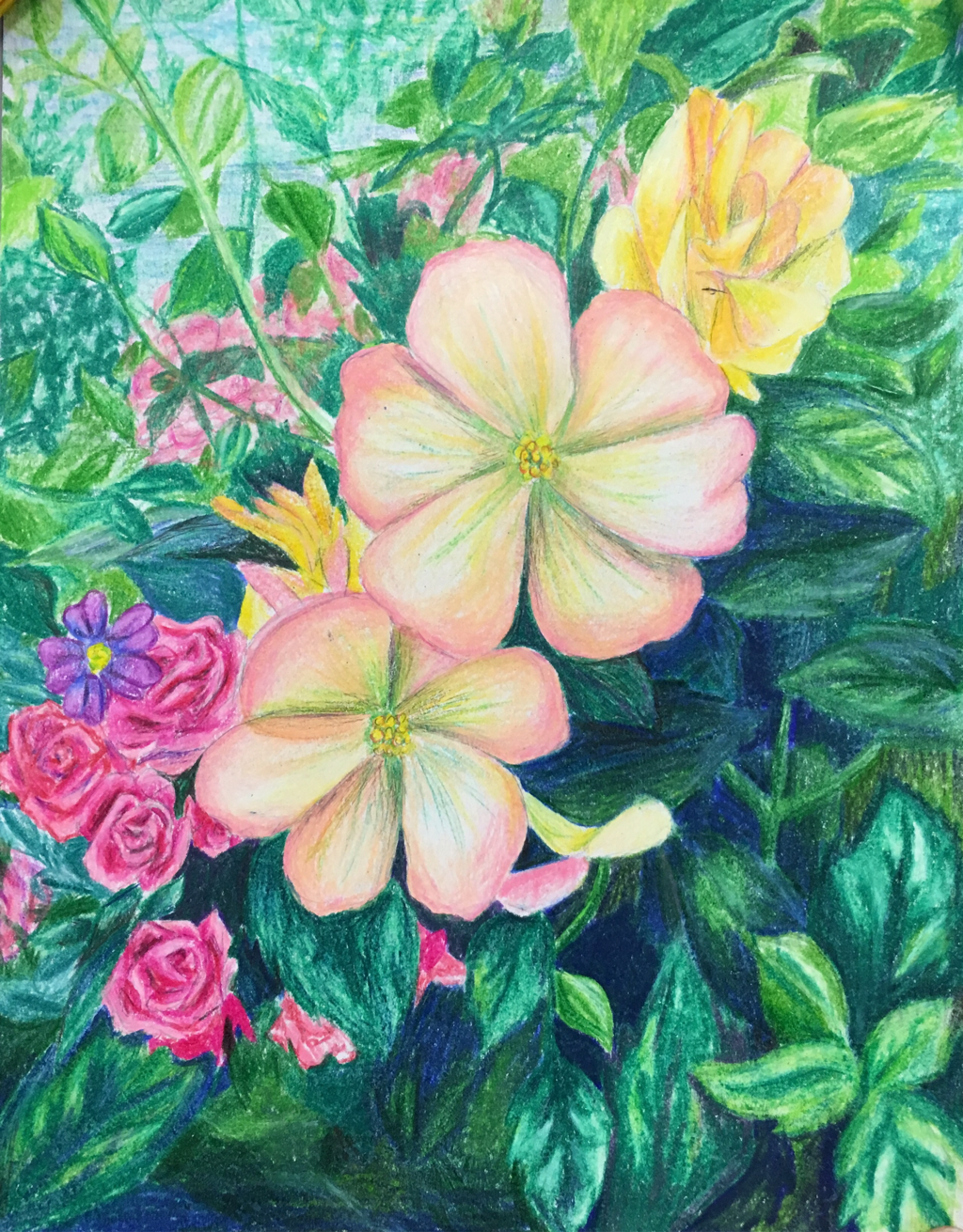 For the two choice projects I did I was told to pick a common theme to have in both, and for these I chose flowers, or nature. This image is one that I took, and I did the project with colored pencils. The art element that really stands out in this piece is value. The different between lights and darks really helps to make the image more 3D, and it helps to show which piece are in the foreground and which are in the background. The skill that I would say I worked on this most for this project would definitely be getting correct values and colors. With something with as much detail as this it is important to get the values and colors right so that it all fits and looks realists. Overall I am pleased with the way the project turned out, and it is one of my favorite drawings.
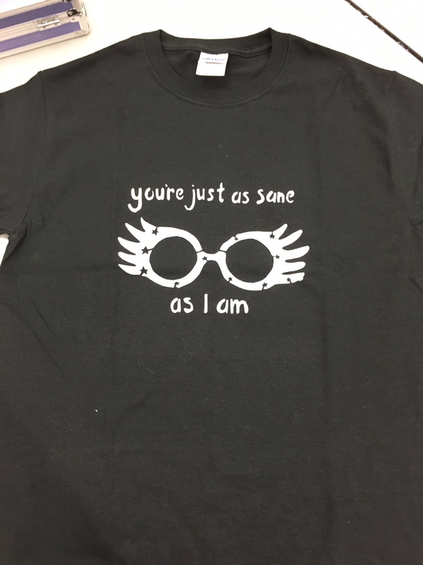 For this shirt design I created the image I wanted, cut out pieces to make it into a stencil, and then we used a screen to print the final design onto the shirt. For this project I feel that the art element I used the most was lines. I had to work on making everything one continuous line so that it stayed connected even when I cut shapes out. I had to turn the letters into lines and even the shape of the glasses. Everything had to be connected to the main sheet of paper. The skill that I would say I worked on the most with this project would be my skills with the x-acto knife. I had to work on precision and making sure not to cut too far or make the lines scratchy. With such small objects to cut out I had to work to be very careful. In the end I was very pleased with the way that my design turned out, and it is a fun shirt that I can take home and wear.
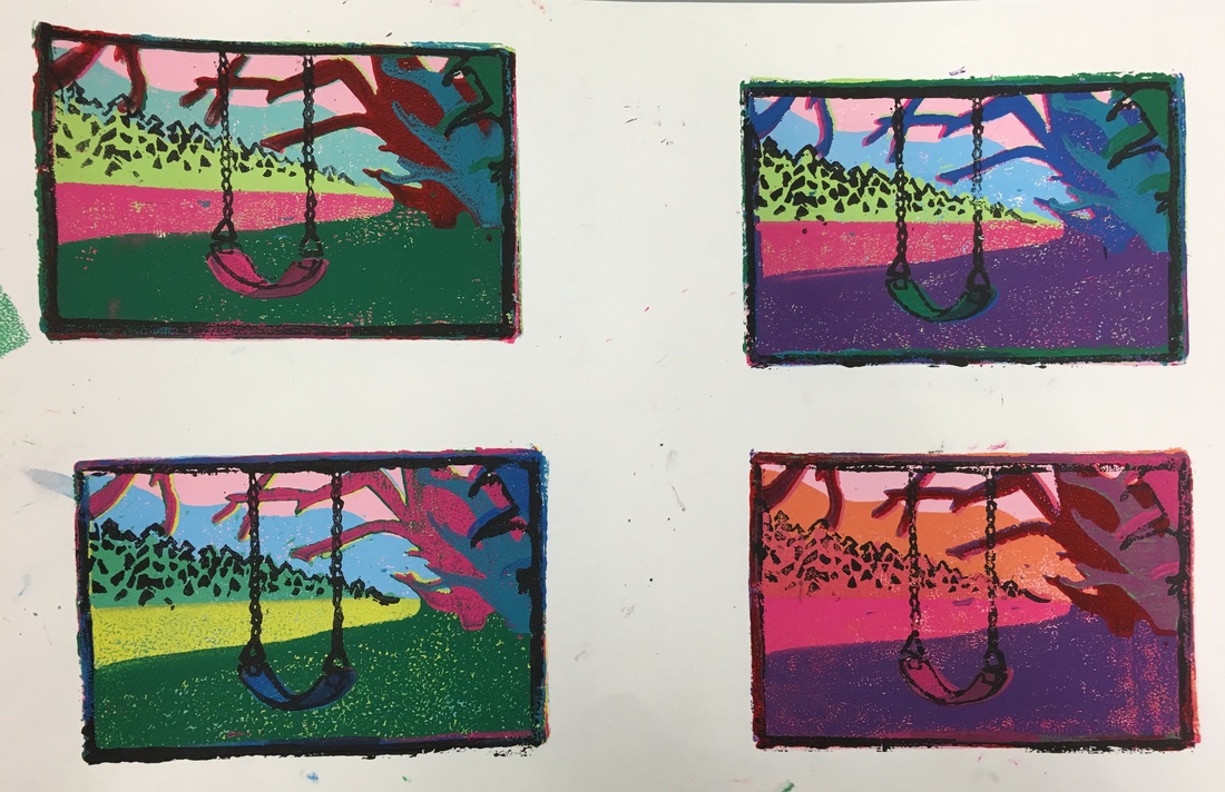
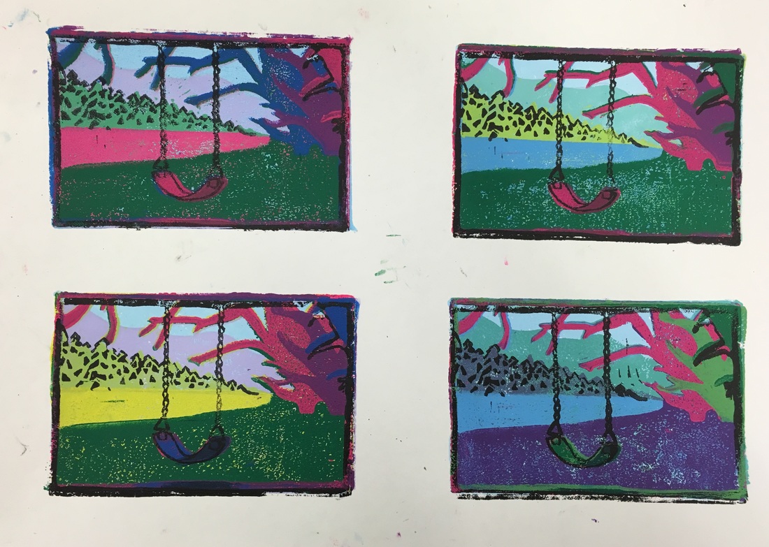
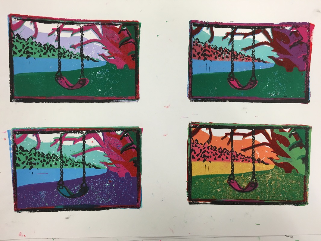
For this block print project I chose to do something more realistic than my last print, and based this print off of an image that I took. This was a reduction print, so I had multiple layers that I carved, and I actually used two different blocks to get the finished look. The main art element that I used in this project would be color, because the varying colors in each layer really make them stand apart. The use of colors also helps with perspective, and creates a background in the distance. A skill that I really worked on when doing this would definitely be my carving skills. There were so many small details, especially in the trees and swing, that I had to be very precise and make sure to make so mistakes. I think that in the end these turned out really well, and they are all unique. None of them are exactly the same, and they are very bold because they don't follow the usual colors you would see in a landscape.
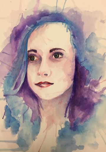 For this project the goal was to create a self-portrait that was unlike the basic self-portraits that you usually see. I decided to do mine with watercolor and to make the face have lots of detail while the rest was more free. The main art element that is used in this project would be color. The different colors that I used are what makes up this piece and create the values in it. The colors also help to make certain parts of the painting stand out. For example, the facial features and hair were painted with much bolder colors than the face itself, and for that reason they are the main focus. While working on this project I also focused on using and improving on one skill, which in this case was using the watercolor. I had to work on mixing the paint with just the right amount of water, blending it correctly, and especially on blowing the paint so that it created all of the different lines you can see above. Watercolor is different than the other paints I usually use, so I really focused on using it properly for my skill in this project. This piece is actually one of my favorites because I feel like it captured me, both with the actual facial features, and the crazy colors and explosions of paint.
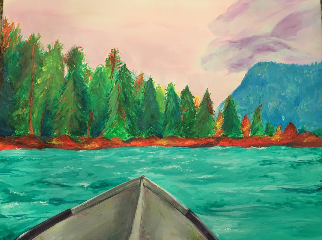 For this painting the goal was to take a normal landscape photo and paint it using arbitrary colors, or random colors that wouldn't usually be associated with a landscape. To create this I used pinks and purples for the sky and clouds, added more green to the water, and added bright reds and oranges to the trees. All of these different colors helped to achieve the overall effect. The main art element in this painting would be value, because each of the values mixed with the paints helps to make the image look more 3D. The different values of each color in the water, the trees, and the mountain make it more obvious where everything is located in the image and that is one of the most important things. While working on this painting a skill that I practiced was using multiple brushes to get different textures or lines. I have a tendency to use one or two brushes for the whole painting. but I really tried to use smaller brushes for the small details and larger, smooth brushes for the background and main areas. The finished painting is one of the most detailed and vibrant paintings that I have created, and it really looks exciting and bright as a finished product.
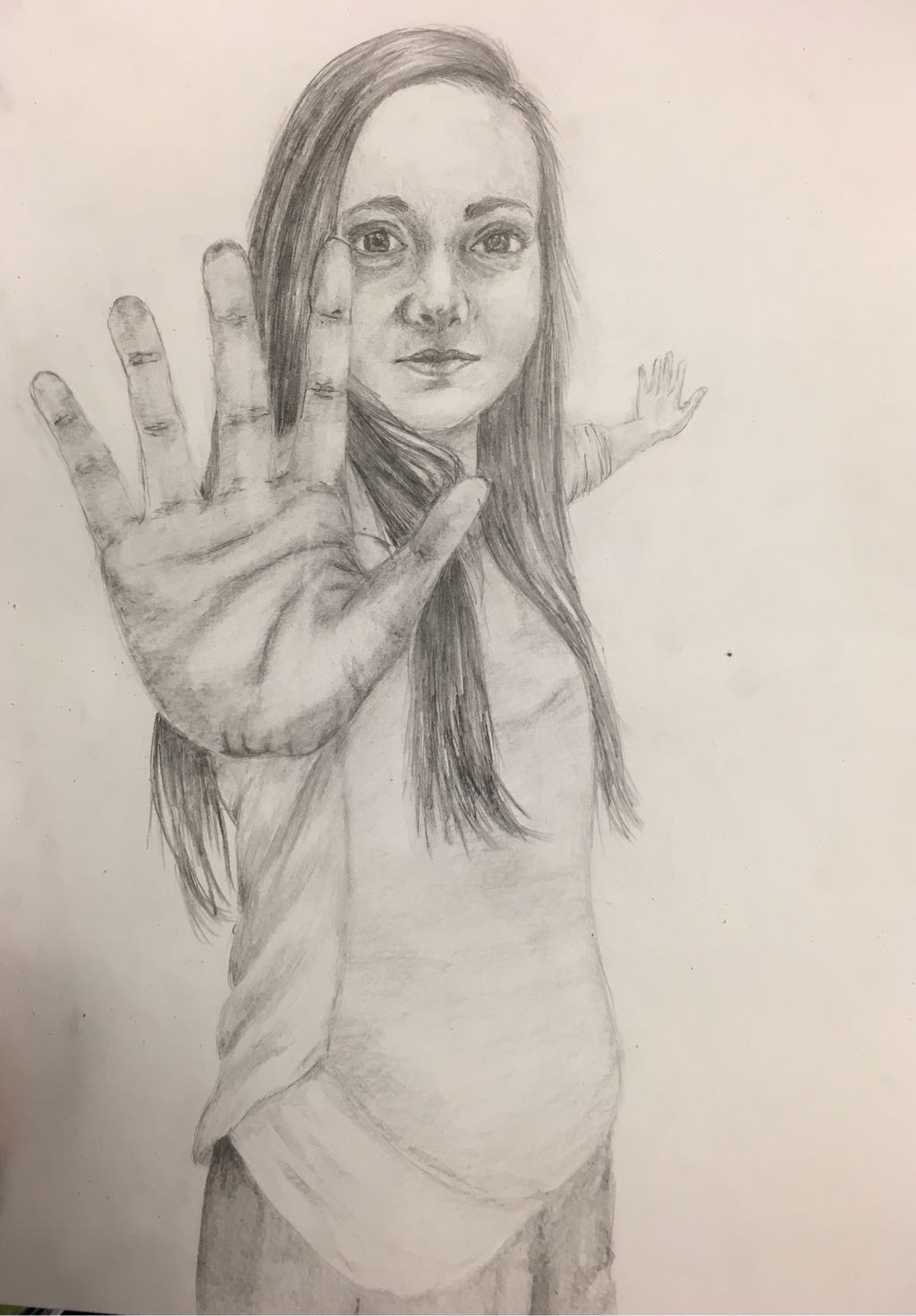 Right now we are focusing on perspective, so this project was to do a foreshortened image. I chose to take a picture of myself with one hand close to the camera, making it extremely large, and another far away, making it un-normally small. For this project I just used a graphite pencil to create the values and lines. While I was working on this project I feel that one skill I really worked with was shading and creating value. When drawing a face and body like this, it is important to get the values right, and I feel like I concentrate a lot on this and used this skill to make it look as 3D as possible. I also feel that the most common art element would be proportion/scale. When doing an image like this where your hand looks abnormally large, you tend to make it smaller than it actually is, and the image does't turn out right. For this project I took multiple precautions to avoid this and I feel that this really shows in the final product. The proportions allows one hand to look closer than the other and also helps to make the facial features proportionate to the rest of my body. Overall I feel like I chose a creative but simple image, and that my final product really represents that.
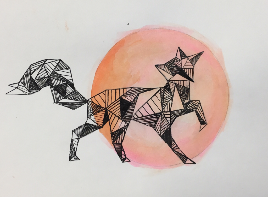 For this project we had to pick which animal best represented us, and personally I found it was the fox. I started with painting in the background using tempura and then I inked in the lines using a calligraphy pen. In this project I feel that the most important element was value. I attempted to make the lines darker or closer together in certain areas, for example where the legs meet the body, to make it look more 3D. This helps to show the shape of the animal instead of a simple sillhouette. The skill that I really used the most in this project is using a calligraphy pen. I have personally never used one before, and being able to control the pen and make the lines thick or tin really adds to the overall image. All of these things help to make my project look clean, have value and dimension, and to represent me. I feel like I have expressed my curious, excited, and shy personality through this animal and the color choice that I chose for the background.
|
Archives
June 2016
Categories |
 RSS Feed
