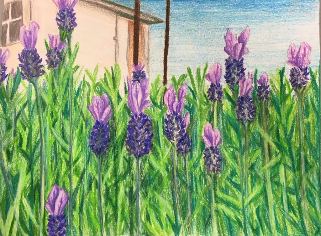
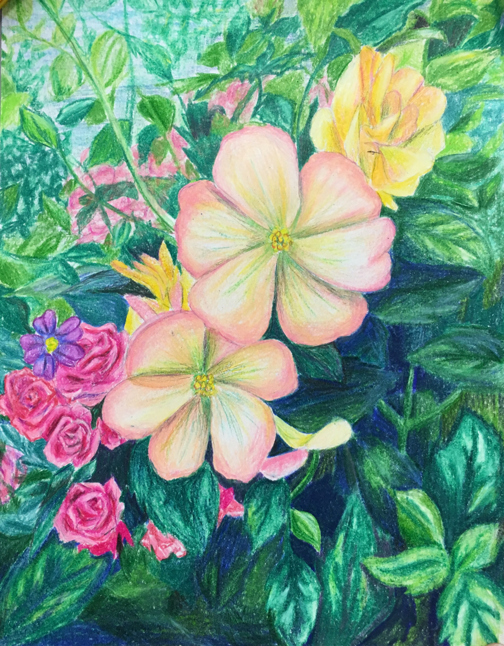
For this second project I continued the flower/nature theme and did another colored pencil drawing. For this piece the art element that seems the most important would be color. The colors in all of the leaves and flowers help them to stand apart from each other and they also help to add value and make it realistic. The skill that I worked on for this piece would be blending, especially on the leaves. I had to work on using the blending pencil to get all the values to look clean and crisp, and to avoid white spaces. This project is also one of my favorites, and I love how unique the lavender is, because it isn't a common flower to draw.
For the two choice projects I did I was told to pick a common theme to have in both, and for these I chose flowers, or nature. This image is one that I took, and I did the project with colored pencils. The art element that really stands out in this piece is value. The different between lights and darks really helps to make the image more 3D, and it helps to show which piece are in the foreground and which are in the background. The skill that I would say I worked on this most for this project would definitely be getting correct values and colors. With something with as much detail as this it is important to get the values and colors right so that it all fits and looks realists. Overall I am pleased with the way the project turned out, and it is one of my favorite drawings.
For this shirt design I created the image I wanted, cut out pieces to make it into a stencil, and then we used a screen to print the final design onto the shirt. For this project I feel that the art element I used the most was lines. I had to work on making everything one continuous line so that it stayed connected even when I cut shapes out. I had to turn the letters into lines and even the shape of the glasses. Everything had to be connected to the main sheet of paper. The skill that I would say I worked on the most with this project would be my skills with the x-acto knife. I had to work on precision and making sure not to cut too far or make the lines scratchy. With such small objects to cut out I had to work to be very careful. In the end I was very pleased with the way that my design turned out, and it is a fun shirt that I can take home and wear.
For this block print project I chose to do something more realistic than my last print, and based this print off of an image that I took. This was a reduction print, so I had multiple layers that I carved, and I actually used two different blocks to get the finished look. The main art element that I used in this project would be color, because the varying colors in each layer really make them stand apart. The use of colors also helps with perspective, and creates a background in the distance. A skill that I really worked on when doing this would definitely be my carving skills. There were so many small details, especially in the trees and swing, that I had to be very precise and make sure to make so mistakes. I think that in the end these turned out really well, and they are all unique. None of them are exactly the same, and they are very bold because they don't follow the usual colors you would see in a landscape.
|
Archives
June 2016
Categories |