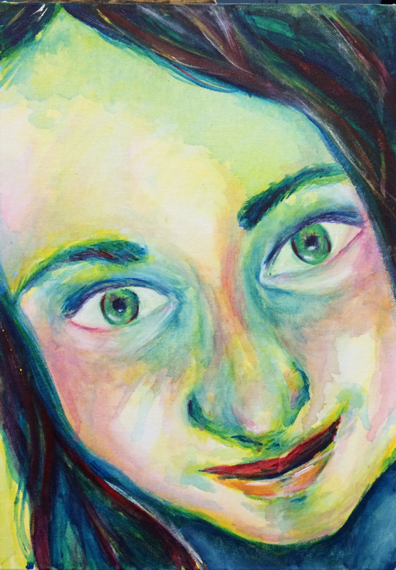
This painting is a self-portrait that was done using the three primary colors, and that shows a very close up view of the face. This painting is meant to be bold, and use colors that are very expressive. A skill that I learned while working on this project is that sometimes painting with your non-dominant hand can help "loosen" up the painting and make you less likely to use it like a pencil. This definitely helped with creating the basic shape of the face and with making it more exciting. In this project, the most used design element would be color, as it makes up the majority of the painting and is what stands out about it the most. The color also adds lots of dimension and tone to the face. Overall the skills and elements I used really helped me to make this a wild, creative, and lively view of myself.
 RSS Feed
