Isolated Print: Set of 1
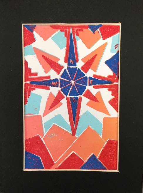
This print was, in my opinion, the best print that I made, so I chose it as the print to matte. One of the layers is a blended layer of orange and pink, and it has four layers in total. The colors contrast nicely in this print, and each of the layers really sticks out against the others. For this print I worked on making sure there was enough ink so that it would print correctly, and tried to be very specific about how it was printed.
Blended Layer Prints: Set of 2
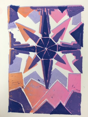
These two prints were made with a blended layer of orange and pink, similar to the isolated print. There is also a large contrast between the first two layers and the second two layers, which really makes the main part of the print stand out. I really worked in these prints to line everything up, and make sure that the colors went from light to dark from the first layer to the last.
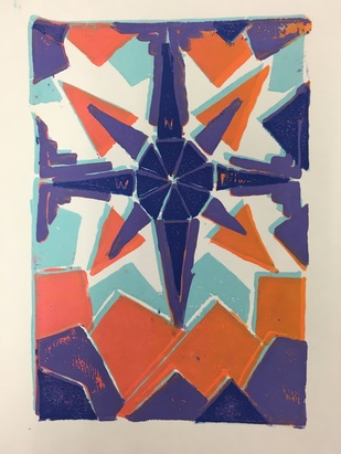
Multi-colored Prints: Set of 9
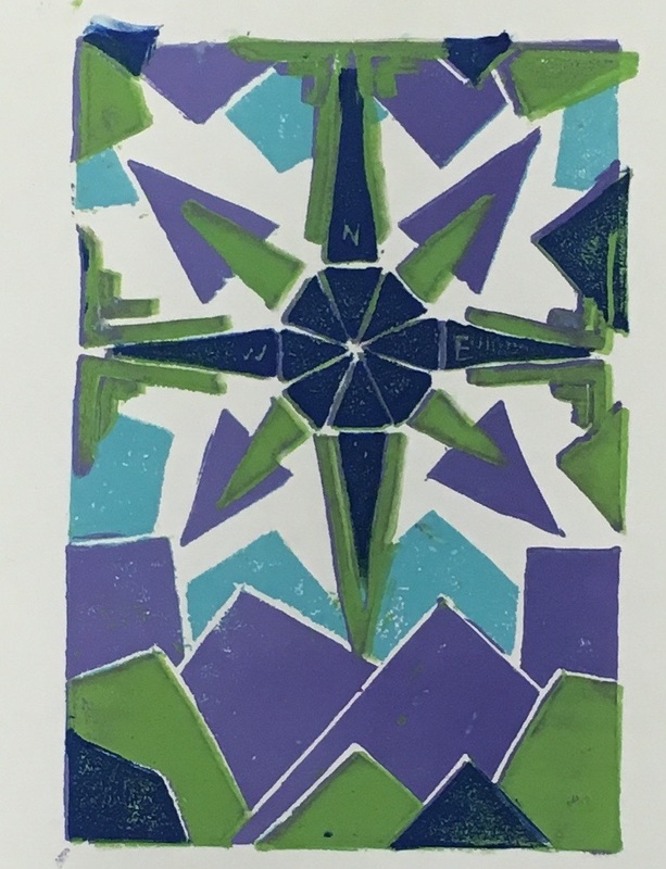
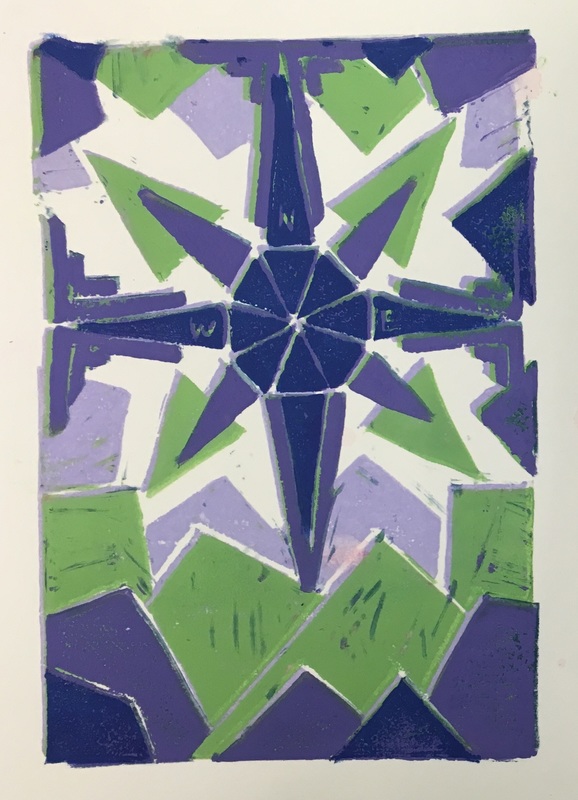
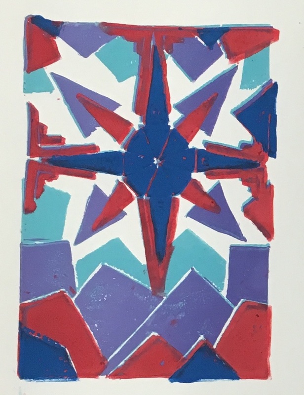
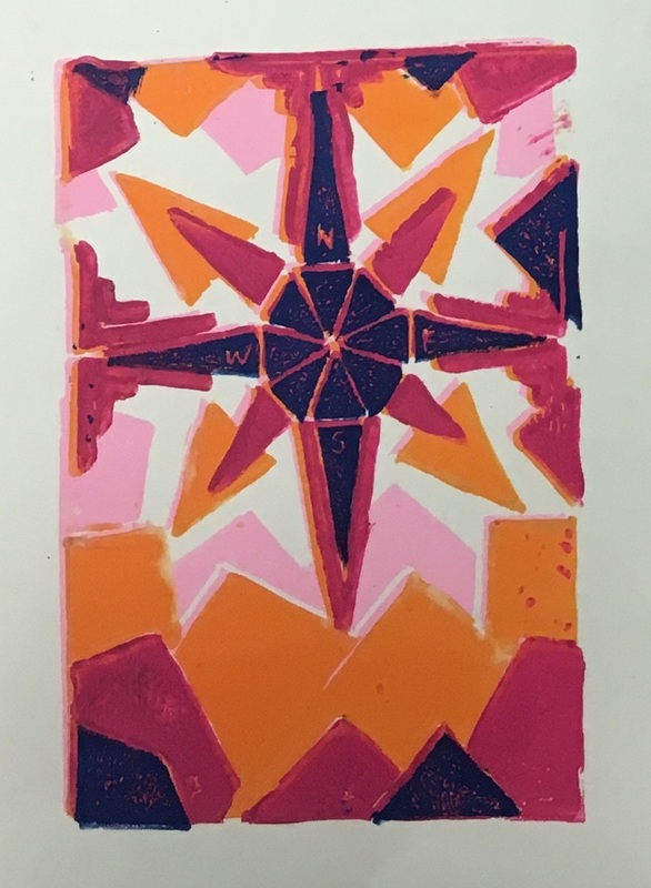
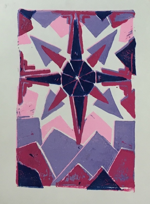
Each of these multicolored prints had the same amount of layers, but they were all one solid color. In these prints I also worked to make the back layers lighter and the front layers darker, and I tried to vary the colors among the prints so that no one looked exactly the same. These prints each turned out a little different and it makes them very unique.
Main Paragraph
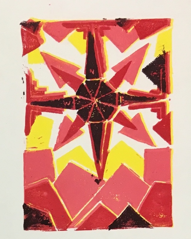
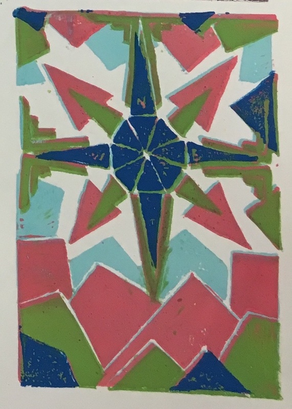
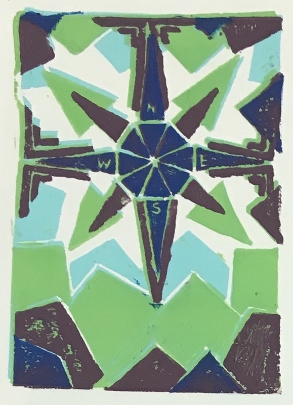
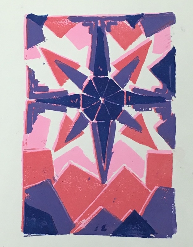
These prints were made to show a compass in the middle, and have triangles all around to represent the mountains and nature around you. Each of the prints have different colors and are each unique. In these prints the design element that I would say I used the most would be color, and that it because it is such a large part of the piece. Each of the colors help to create the different layers and make them stand out and be exciting. During this process I really worked on the skill of making each of the layers line up very closely. On some of these prints I achieved this skill better than the others, but it is really important because it helps to make the final image clear and neat. These sets and each of the prints in them are all using very bright, positive colors, and this makes them pop and also helps to draw people's attention to them. The colors also help to represent all of the bright colors in nature, which is the main point of my design.
 RSS Feed
