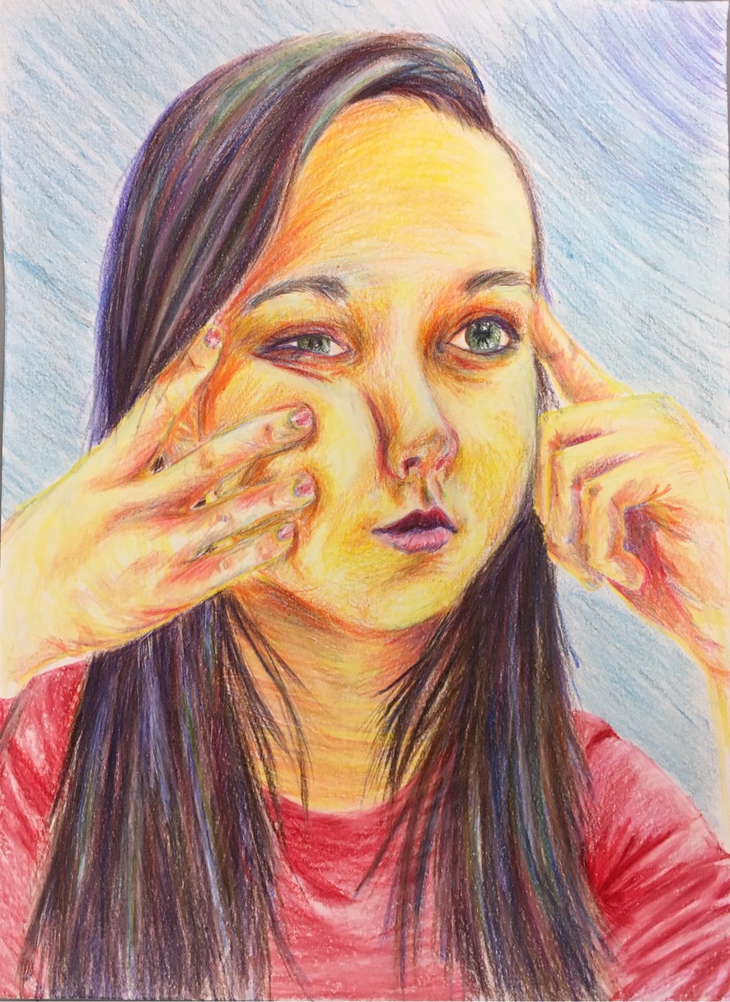
This self portrait is a three-quarter view where my hands are pressing on my face, changing the shapes of my facial features. This portrait was done using colored pencils and using lots of different, bright colors. The element that I used most in this project would be color, because I chose to out bright colors and values throughout the portrait that really made it stand out. I also worked on the skill of making the proportions just right so that the face looks realistic, natural, and as much like me as possible. These two things and many other skills really made this drawing accurate and a very bright, positive portrayal of myself.
For this landscape painting I created a monochromatic look by only using different shades of blue. By mixing white, black, and blue tempera paint I was able to get each of the individual values in the picture. The design element that is the most prominent in this painting is value, because I had to use so many specific shades to make each shape stand out. The value is what really makes everything show up in the painting despite it all being the same basic color of blue. It also helps to show distance in the painting by making things look further aqua or closer up. A skill that I used in this painting is to make the correct values, and improving on mixing the paints was very important to the final look. The final painting ended up being very detailed and complete due to the use of this element and skill. It also has an overall serene feeling due to the blues and the painting's wintery appearance.
|
Archives
June 2016
Categories |