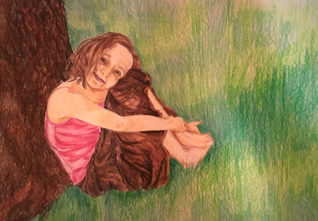
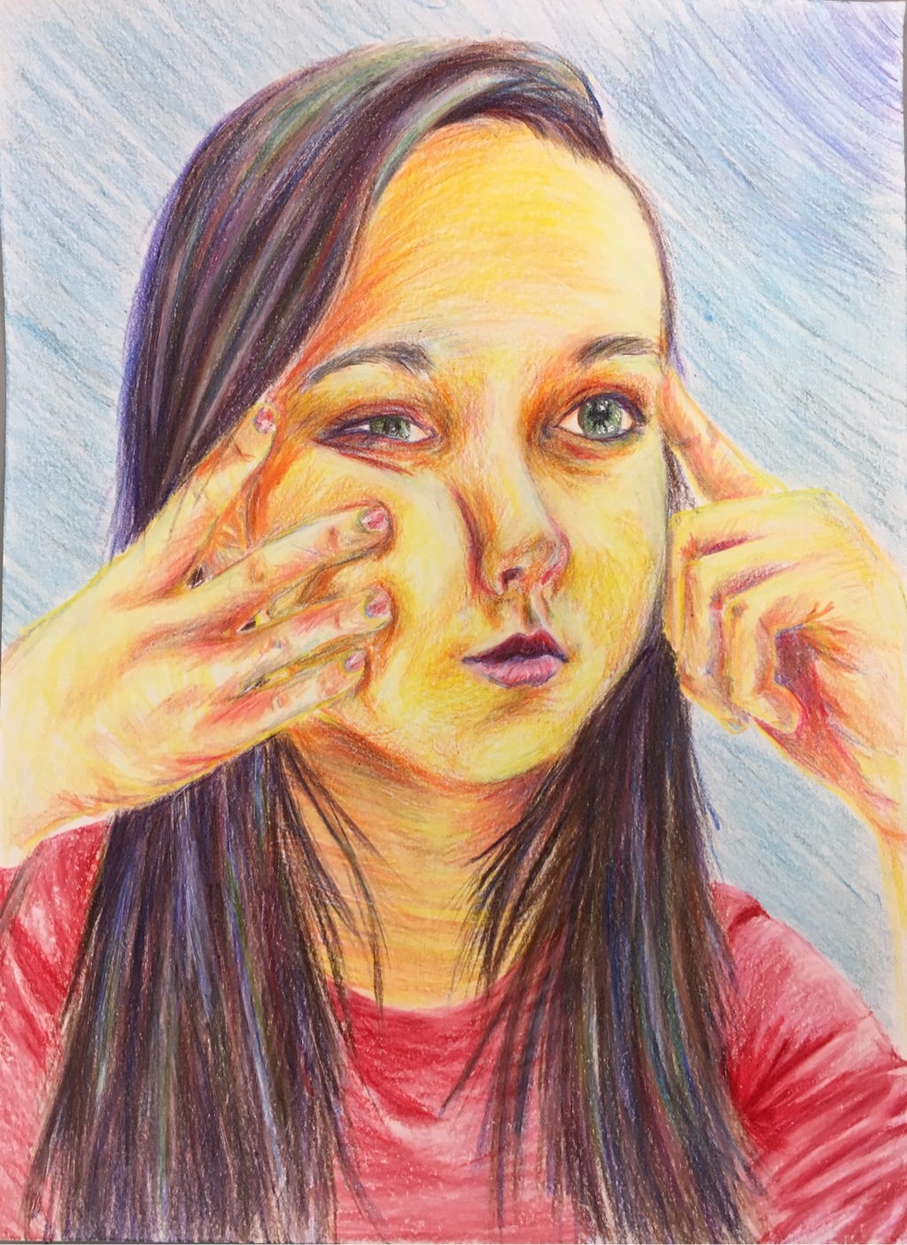
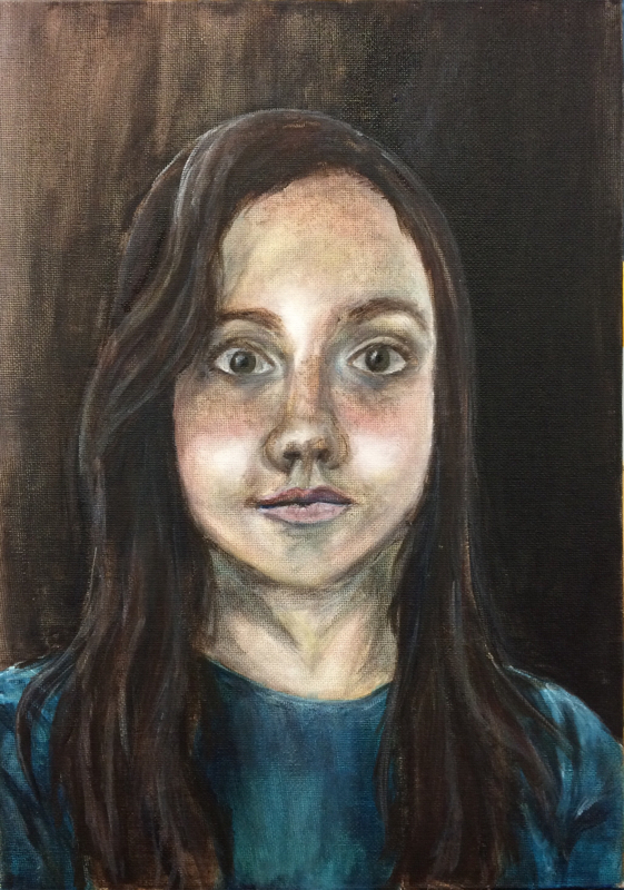
For this project my theme was identity,and I decided that something that represents who I am the most would be a drawing of myself as a young child, when I first started finding what was important to me. For this project I used colored pencils, and tried to focus on adding detail to myself and making the background more simple.In this project I feel like the main element that I used would be emphasis. This is used because I made the image of me stand out from the rest. I also focused on learning new skills for each project,and in this one I worked on figuring out how to get the proper skin tone color,and getting the shades just right. This is something that I have struggled with before, and feel that I improved as I worked on this project. Overall the emphasis and detail that I used help to show me in a lifelike and meaningful way. By putting the focus on my image I am putting the focus on who I am, and showing myself as I was starting to figure out who I am. This project is colorful, meaningful, and really represents my identity.
For this choice project I chose to draw this tractor based on an image I had previously taken, and to do this I used colored pencils. The art element that is the most important in this image would be value, because value is what makes everything stand out. Without value the tractor wouldn't look 3D, and all of the trees in the background would blend in together. In order to get the right value throughout this project I really had to work in the skill of blending colored pencils. It is important to press firmly when using them so that the image looks smooth and so that the colors blend together to make the perfect shade. By using these two things I feel like this project has turned out very successfully, and it really has a large amount of detail, which is something I focus on a lot. It also focuses largely on nature and color which are very important to me
For this painting we had to chose two different items that represented us, and then put them together with a vase, or vessel. After taking a picture of the objects, I used acrylic paint to do the project. While painting this the art element that I used the most was value, because value was very important in making the objects look 3D. All of the light and dark values really help to add to the image and make it look as realistic as possible. A skill that I worked on was mixing the paints to get just the right shade to match the picture. Working on this also helped to make the image look more realistic. Overall this image represents me because these objects are a part of who I am, and the colors as well as the meanings behind them show who I am as a person.
Isolated Print: Set of 1This print was, in my opinion, the best print that I made, so I chose it as the print to matte. One of the layers is a blended layer of orange and pink, and it has four layers in total. The colors contrast nicely in this print, and each of the layers really sticks out against the others. For this print I worked on making sure there was enough ink so that it would print correctly, and tried to be very specific about how it was printed. Blended Layer Prints: Set of 2These two prints were made with a blended layer of orange and pink, similar to the isolated print. There is also a large contrast between the first two layers and the second two layers, which really makes the main part of the print stand out. I really worked in these prints to line everything up, and make sure that the colors went from light to dark from the first layer to the last. Multi-colored Prints: Set of 9Each of these multicolored prints had the same amount of layers, but they were all one solid color. In these prints I also worked to make the back layers lighter and the front layers darker, and I tried to vary the colors among the prints so that no one looked exactly the same. These prints each turned out a little different and it makes them very unique. Main ParagraphThese prints were made to show a compass in the middle, and have triangles all around to represent the mountains and nature around you. Each of the prints have different colors and are each unique. In these prints the design element that I would say I used the most would be color, and that it because it is such a large part of the piece. Each of the colors help to create the different layers and make them stand out and be exciting. During this process I really worked on the skill of making each of the layers line up very closely. On some of these prints I achieved this skill better than the others, but it is really important because it helps to make the final image clear and neat. These sets and each of the prints in them are all using very bright, positive colors, and this makes them pop and also helps to draw people's attention to them. The colors also help to represent all of the bright colors in nature, which is the main point of my design.
This self portrait is a three-quarter view where my hands are pressing on my face, changing the shapes of my facial features. This portrait was done using colored pencils and using lots of different, bright colors. The element that I used most in this project would be color, because I chose to out bright colors and values throughout the portrait that really made it stand out. I also worked on the skill of making the proportions just right so that the face looks realistic, natural, and as much like me as possible. These two things and many other skills really made this drawing accurate and a very bright, positive portrayal of myself.
For this landscape painting I created a monochromatic look by only using different shades of blue. By mixing white, black, and blue tempera paint I was able to get each of the individual values in the picture. The design element that is the most prominent in this painting is value, because I had to use so many specific shades to make each shape stand out. The value is what really makes everything show up in the painting despite it all being the same basic color of blue. It also helps to show distance in the painting by making things look further aqua or closer up. A skill that I used in this painting is to make the correct values, and improving on mixing the paints was very important to the final look. The final painting ended up being very detailed and complete due to the use of this element and skill. It also has an overall serene feeling due to the blues and the painting's wintery appearance.
This is a landscape that was done with acrylic paint, and was intended to show all of the values and colors in a landscape. One skill that I really tried to work on while doing this painting is adding highlights and shadows to the trees in different areas so that they truly look 3-Dimensional instead of flat and stiff. Of all of the design elements this painting uses value the most, because I tried to capture each individual value by mixing the paints to get just the right shadow or color. The value also helped to show the distance in the painting, and make it look more natural. I worked hard on this painting, and on top of the value and 3D look it has, it also shows my take on nature and how I see this landscape when I look at it, making it a very original painting.
This drawing is made up of multiple, odd shaped boxes that each have three vanishing points, and appear to be in bird's eye view. While doing this project I learned that it is important to always draw lines as light as possible at first and then darken them at the end. This helps leave less line marks and in the end the bold lines really make the shapes pop. Out of the design elements the one I used most in this drawing would be space. This element really helps to show the distance between the boxes and how they fade back into the distance. As I finished this drawing these two things really helped me create a 3-dimesional drawing that has clean and sharp lines throughout.
This painting is a self-portrait that was done using the three primary colors, and that shows a very close up view of the face. This painting is meant to be bold, and use colors that are very expressive. A skill that I learned while working on this project is that sometimes painting with your non-dominant hand can help "loosen" up the painting and make you less likely to use it like a pencil. This definitely helped with creating the basic shape of the face and with making it more exciting. In this project, the most used design element would be color, as it makes up the majority of the painting and is what stands out about it the most. The color also adds lots of dimension and tone to the face. Overall the skills and elements I used really helped me to make this a wild, creative, and lively view of myself.
This self-portrait was done on a canvas, and by using only brown, black, white, and the primary colors it has a style similar to portraits done during the Renaissance period. One thing that I learned while making this is how important it is to layer paints. By starting with brown paint and a basic shape it helped me get the right shapes and shades later on that really made it accurate and three-dimensional. The most emphasized design element in this painting would be value, and that is because it creates the darks and lights that make the face, hair, clothing, and background look more realistic and stand out. Overall, this skill and value really helped me to create a detailed, three-dimensional, and very serious rensaissance-esque image of myself that is like no portrait I have ever made before.
|
Archives
June 2016
Categories |