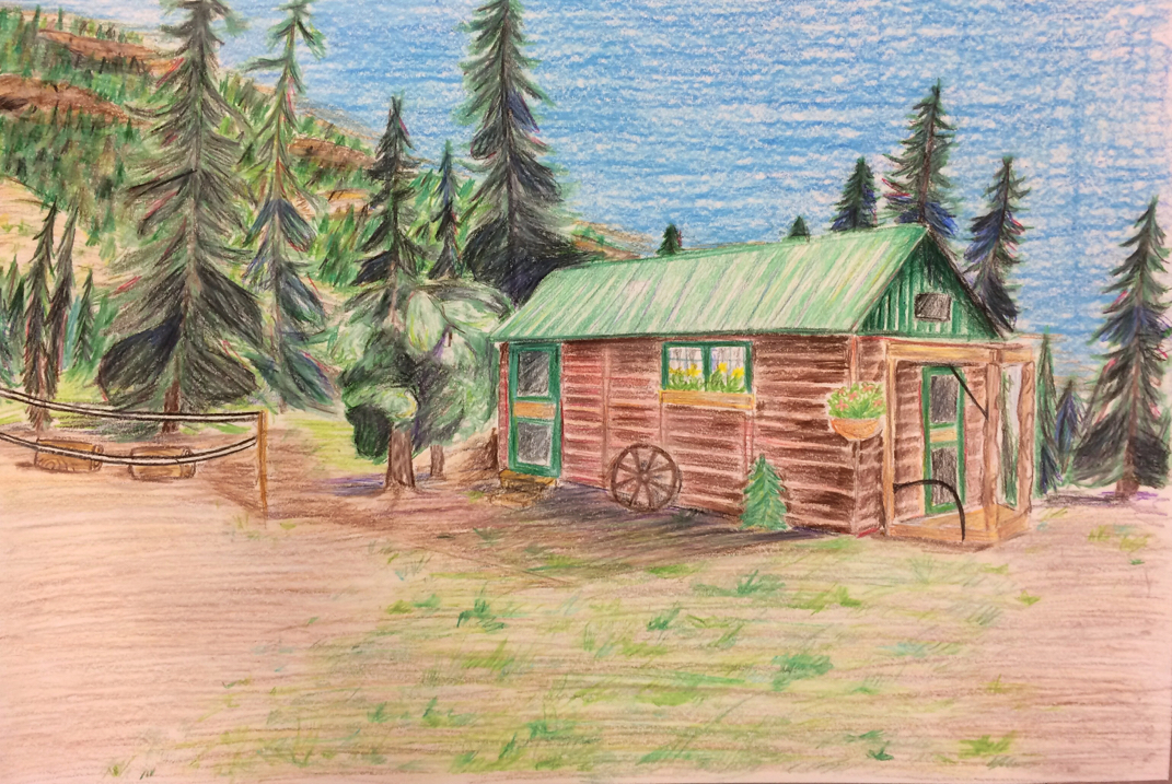
For my choice project, I chose to do another landscape, but this time with colored pencils. I worked on varying the shapes and colors of things to make parts stand out, and on blending with the pencils. In this drawing I used the basic elements of line, shape, form, and I used a lot of color throughout the drawing as well. By having it look complete and correctly sized, I also use the design elements of unity and proportion/scale. This drawing is bright and colorful, and is overall very positive.
This painting is done with tempera and is based on the same photograph as the dull landscape painting. However, this painting uses impressionist color, meaning it uses more primary and complementary colors to make it look bright. I continued working on putting complementary colors together, and using purples, blues, and other colors to make shadows instead of black. In this painting I used the basic art elements of line, shape, form, texture, color, and space. I also used the design elements of contrast between complementary colors, proportion/scale, and emphasis. This painting has a brighter more positive look than the dull painting, and has more of a natural light look than others. This piece was done using tempra paint, and is based off of a picture I took in Colorado. The point of this painting was to use only brown, peach, black, red and green, or to use local color. I worked on looking at photos in different edits to see how dark or light a certain part of the painting needs to be. In this painting I used the art elements of line, shape, form, texture, and color. The design elements were proportion/ scale, unity, and emphasis on the lager trees. This painting looks dark due to the colors used, and it almost gives off that kind of feeling as well. |
AuthorMSHS Art Class Archives
June 2015
Categories |