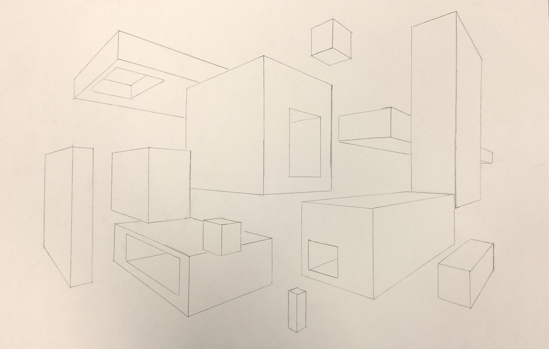
This two-point perspective drawing was done using a pencil and a ruler. In this drawing I used the art elements line, form, and space. I also used the design elements of proportion and scale, and unity. As these boxes overlap, and have holes inside of them, it makes the drawing look complex, and helps to show the illusion of space as they fade into the distance. This drawing overall is very simple, but the placement of the boxes makes it look intricate.
This poster is done with tempera paint, and the letters are colored in with colored pencils. Throughout this composition I used the art elements of line, shape, value, and color. I also used the design elements of balance, proportion, and emphasis. The emphasis is put mostly on the center light bulb. This poster is inspiring, and all of the elements together help to make it look positive and bright.
This is a masthead design for my website created with colored pencils, that shows the name of my site. While making this project, I learned how to blend colored pencils to make a better look, and how to use complementary colors to make things stand out. The art elements I used in this project are line, shape, value, and color. The value is shown in the difference of color in the bricks and paint cans, and the color is used to make things stand out. The design elements I used are emphasis, in making the canvas stand out, unity, as the bricks go throughout the drawing, and contrast between the complementary colors to help parts of the drawing vary from the rest. Overall the drawing expresses my representation of art, and shows how art can often be messy and appear ruined, when in fact you only make it better.
This moving line project is a pencil drawing using curved lines, overlap, and chiaroscuro to create a composition. During this project I learned how to draw objects and make them appear to have overlap, and how to make lines fade from dark to light. The art elements I used are line, value, and space. As I drew the lines, the different shades of pencil created value, and the overlap helped to create space. I also used the design elements of contrast between the dark and light, movement as the lines move across the page, and patterns throughout the composition. These different elements make the drawing look playful, with different swirls and lines darting across the page, and express my positive outlook on things.
|
AuthorMSHS Art Class Archives
June 2015
Categories |